.gallery-item:nth-of-type(3n+2):last-of-type
I was working on a gallery with rows of 3 items per row for which the markup contained <br> after every third .gallery-item and the CSS used floats. It didn’t look how I wanted it to and needed to change it anyway, so I decided to also get rid of the floats and break-tags and use display: flex instead.
Grid would have been ever nicer because it would give more control, but also, for now, requires more lines of CSS to make it work in more browsers, so I opted for flexbox with space-between.
The markup isn’t mine but from WordPress, so I can’t/don’t want to change that, but I can disable the break-tags with CSS: #gallery-2 br { display: none; }.
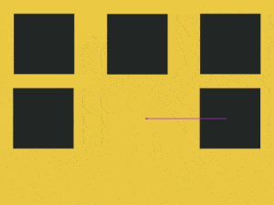
What I like about space-between is that it makes the child-elements line up flush with the outer edges of the parent element. What I don’t like about it is that if the last row has less items on it, especially if it’s two instead of the number on the previous rows, you’ll get a big gap in the middle. When it’s 3 instead of 5, I don’t mind, or 4 instead of 5, but 2 instead of 4 or instead of 3, I think looks like you didn’t know what you were doing.
So I wanted to add some CSS rules to the last .gallery-item (last-child would have targeted the last <br>) but only if it was the second .gallery-item of a row.
#gallery-2 {
    display: flex;
    justify-content: space-between;
    flex-wrap: wrap; /* or it'll put everything onto the same row */
    position: relative;
}
#gallery-2 br {
    display: none; /* or display:flex will take them into account */
}
#gallery-2 .gallery-item {
    float: none; /* overriding the original float:left */
    width: 300px; /* overriding the original width:33% */
}
@media only screen and (min-width: 1024px){
/* on smaller screens the rows will have 2 or 1 item per row */
    #gallery-2 .gallery-item:nth-of-type(3n+2):last-of-type {
    /* 2nd item on a row of three but only if it's the last of its kind */
        position: absolute;
        bottom: 0;
        left: calc(50% - 150px);
    }
}