What: When using CSS columns, the content doesn’t always line up at the top of each new column. The more columns you have, the more likely you are to run into this problem, especially if you’re using column-fill: balance. And the problem seems to happen in Chrome-based browsers, in Safari and in browsers on iOS.
The use of React complicates front-end build. We have very talented front-end developers, however, they are not React experts – nor should they need to be. I believe front-end should be built as standards-compliant HTML/CSS with JavaScript used to enrich functionality where necessary and appropriate.
Simon R. Jones, Studio 24 talking about developing for Gutenberg
Restricting Access to Content in WP
A few notes on how to restrict access to content in WordPress, both for anonymous visitors and logged-in visitors with a specific user role, by using wp_safe_redirect().
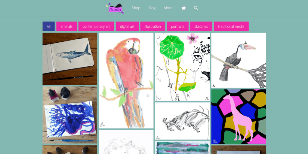
WP Media Library Front-end Gallery
Using a WordPress loop to pull images directly from the WordPress Media Library and displaying them with a shortcode.
A crucial part of filtering the images you want to show from the rest of what is in your media library is done by attaching a taxonomy to the media library items. This has the added benefit of creating the foundation needed to allow for filtering of the gallery on the front end as well.
WP version 5.5
This update has a few changes that make me happy!
What: First and foremost: a simple way to filter archive titles. Yay! Hooray! Tired of
Category: Books
or
Archive: Products
You can change that Category: or Archive:, or any other archive title prefix, to anything you want or remove it altogether.
Removing Spaces from Filenames on Windows
I received 60 documents to put online, beautifully named, but with SPACES!!! Aaaah!
Thankfully, you can bulk remove them in a powershell: hooray! This simple, understandable and beautiful solution on Stack Overflow shows you how:
Database Storage Engine
I have run into more than one database that has both MyISAM and InnoDB tables and I’m very happy to know that I can change all of them into InnoDB–providing it’s at least MySQL 5.6.4.
This little, practical article from Kinsta tells how and has more detail, but basically, you can just change it from a dropdown once you’re in phpMyAdmin, or you can use:
Free Software for Animation
Once a year I teach Animation & Interaction at MKstart in Amsterdam. When I started teaching this class over 10 years ago, I used Flash. I’d make some very tiny animations with them during the first few classes and then some mini games during the last few classes. I loved it, they loved it, it was great. When Flash died, eventually I switched to Animate. The brush tool is still the same, the regular crashes are the same, but working in Canvas has made Animate more buggy and unreliable. I haven’t found any good alternatives so I use it anyway.
Jittery Scrolling
What: Jittery Scrolling, or very slow scrolling in Chrome-based browsers. It’s caused by too many paint operations when scrolling, in my particular case caused by an SVG set as a background-image with background-size: cover and background-attachment: fixed.
Media Queries for Input Devices
What: Since not every touch enabled device is a handheld device, checking for size and checking for touch should be handled separately, since the changes to the design and functionality they require are not the same.
How: You can use media queries.